Blood Sugar Report for Your Doctor Appointment (2026)

How to Put Together a Blood Sugar Report for Your Doctor Appointment (2026)
Walking into your appointment with a clear blood sugar report makes the whole visit more productive. Instead of reciting numbers from memory or handing over a messy notebook, you give your doctor something they can read at a glance — which leaves more of your limited appointment time for the actual conversation about your care. But what should that report contain, and how do you actually create one?
This guide walks through the anatomy of a good blood sugar report, how to generate one, which format works best, and a quick checklist so it's ready when you sit down with your doctor. Current for 2026.
Medical disclaimer: This article is for general information only and is not medical advice. Blood Sugar Monitor is a tracking tool, not a medical device — it logs the readings you take with your own glucose meter or CGM and does not diagnose or treat any condition. Always follow the guidance of your qualified healthcare provider.
A doctor-ready report in seconds
Blood Sugar Monitor turns your logged readings into a clean report (PDF or CSV) for any date range — with trends, target ranges, and context — ready to print, email, or show at your appointment. Free to start.
Why bring a report instead of just your numbers?
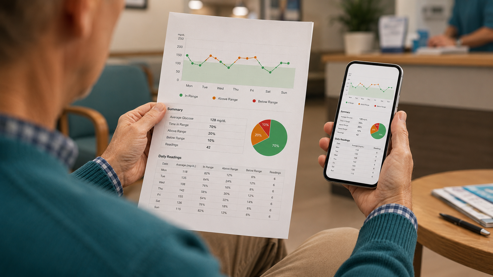
A report does two things a verbal recap or a pile of loose readings can't: it presents your data in a form your doctor can absorb quickly, and it shows patterns rather than isolated values. That means a more focused, useful conversation in the short time you have together. The good news is you don't have to build it by hand — a tracking app can generate the whole thing from the readings you've already logged. (For the bigger picture on what your doctor is looking for and the different ways to share, see our guide on how to share blood sugar readings with your doctor.)
What a good blood sugar report includes
An effective report isn't just a long list of numbers. The elements that make it genuinely useful:
| Report element | Why it helps your doctor |
|---|---|
| A clear date range | Frames the period since your last visit |
| Readings with timing | Shows fasting vs around-meal context |
| Trend charts | Make patterns visible at a glance |
| Averages | Summarize the period quickly |
| Highs and lows in context | Flag readings outside your target range |
| Notes and other metrics | Add context and the fuller picture |
Notice the emphasis on trends, timing, and context rather than raw volume of numbers — that's what turns a data dump into a useful report. An app export assembles these elements for you automatically.
How to create your blood sugar report
You have a few routes, depending on how you track:
- From a tracking app. The simplest path — choose your date range and export a ready-made report as a PDF or CSV, with charts and context already laid out.
- From your meter or CGM software. Some devices can produce their own reports, though usually only for that device's data.
- By hand from a paper log. Possible, but time-consuming and harder for your doctor to read — you'd be transcribing and summarizing manually.
For most people the app route is fastest and cleanest, since the report builds itself from readings you've logged along the way. You can generate one free before your next visit.
Choosing the right format
Two formats cover almost every situation. A PDF is the most readable — charts and tables laid out neatly, easy to print or view on a phone, ideal for handing to or showing your doctor. A CSV is the raw data in spreadsheet form, useful if your clinic wants to import the numbers. When in doubt, a PDF is the safe choice for a human to read. It's also worth checking your clinic's preference and how they'd like to receive it — printed, on your phone, or through a patient portal. A good app offers both formats so you're covered either way.
Your appointment-day checklist
Before you head in, run through this so your report does its job:
- Set the date range to cover the period since your last appointment.
- Generate the report in a format you can actually present — printed or on your phone.
- Skim it yourself first and note any patterns or questions you want to raise.
- Have a backup — email it to yourself or save a copy so you're not relying on a single device.
A couple of minutes of prep means you arrive ready to talk rather than fumbling for numbers. You can have your report ready in just that.
How an app generates your report in seconds
This is where logging consistently pays off. Because your readings, timing, notes, and other metrics are already captured, producing the report is just a matter of choosing a date range and exporting — the charts, averages, and target-range context are assembled for you. No transcribing, no manual math, no messy notebook. You can try it free and walk into your next appointment with a clean, professional summary.
Arrive with a report, not a notebook
Log your readings as you go, then export a clean PDF or CSV report for any date range — with trends, averages, and context — ready for your appointment. Free to start.
Frequently asked questions
What should a blood sugar report for a doctor include?
A useful report covers a clear date range since your last visit, your readings with their timing, trend charts, averages, any highs and lows relative to your target range, and notes for context — plus other relevant metrics if you track them. The emphasis should be on patterns and context, not just a long list of numbers.
How do I create a blood sugar report for my appointment?
The easiest way is to export one from a tracking app: choose the date range and generate a PDF or CSV with your readings, charts, and context already laid out. You can also use your meter or CGM software, or summarize a paper log by hand, though those take more effort and are harder to read.
What format is best for a blood sugar report?
A PDF is usually best for a doctor to read, since it lays out charts and tables neatly and is easy to print or show on your phone. A CSV provides the raw numbers in spreadsheet form if your clinic wants to import them. Check your clinic's preferred format and delivery method.
What date range should my blood sugar report cover?
Generally the period since your last appointment, so your doctor sees the full stretch they haven't reviewed. A tracking app lets you set any date range — from a single day up to several months — to match what your care team needs.
Can I email my blood sugar report to my doctor before the appointment?
Often yes, if you export it as a PDF or CSV, but check your clinic's preferences and privacy practices first. Some offices prefer you bring it to the visit or upload it through a patient portal rather than by email.
Does the app create the report for me?
Yes. Because your readings, timing, notes, and other metrics are already logged, the app assembles them into a report for the date range you choose — with charts, averages, and target-range context — so you don't transcribe anything by hand. It organizes readings you took with your own meter; it doesn't measure or interpret them for you.
blood sugar report for doctor appointmentblood sugar report for doctorglucose report for doctorcreate blood sugar reportblood sugar summary for doctordiabetes report pdfexport blood sugar reportblood sugar chart for appointment