4000K vs 5000K for a Kitchen: Which Should You Pick?

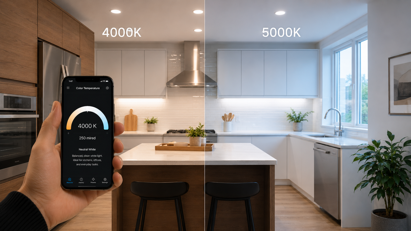
4000K vs 5000K for a Kitchen: Which Should You Pick?
When you're lighting a kitchen, 4000K and 5000K are the two color temperatures that come up most — both bright and clean, but with a real difference in feel. The quick answer: 5000K is cooler and bluer (true daylight), while 4000K is a neutral white that's a touch warmer. For most kitchens, 4000K is the balanced, comfortable sweet spot; 5000K wins when maximum task clarity and crisp, daylight-like visibility matter most.
This guide walks through what each looks like, the trade-offs for a kitchen specifically, and how to use them together. If you're trying to match existing fixtures or see what you've already got, you can measure your kitchen's color temperature with your phone.
📲 Check your kitchen's current lighting
Kelvin Light Scale reads color temperature from your iPhone, so you can tell 4000K from 5000K and keep your kitchen fixtures consistent.
The quick answer
5000K is the cooler of the two — a crisp, bright, slightly blue-white that mimics midday daylight. 4000K is a neutral white: clean and bright, but without the cool blue edge, so it feels a little softer and more comfortable in a living space. Neither is “warm” like a 2700K living-room bulb; both are in the bright, functional range. For a kitchen that doubles as a gathering space, 4000K is usually the easier choice; for a hardworking prep kitchen or detailed cooking, 5000K delivers the most clarity. You can measure a bulb to know exactly which you're dealing with.
How the Kelvin scale works here
On the Kelvin scale, lower numbers are warmer and higher numbers are cooler. The warm home bulbs sit around 2,700–3,000K; 4,000K lands in the neutral middle; and 5,000K reaches the cool, daylight end. So moving from 4000K to 5000K shifts you noticeably toward a cooler, bluer, more energizing light. That 1,000K gap is larger and more visible than the subtle 2700K-versus-3000K difference, which is why the choice matters more in a kitchen. Confirm where a fixture falls with a quick reading.
What 4000K looks like
4000K is “neutral” or “cool white” — bright and clean without tipping into blue. It renders colors accurately, makes a space feel fresh and tidy, and stays comfortable enough that a kitchen still feels inviting rather than clinical. It's a favorite for kitchens precisely because it bridges atmosphere and function: bright enough to cook under, soft enough to enjoy a meal in.
What 5000K looks like
5000K is “daylight” — the crisp, bright blue-white of midday sun. It maximizes contrast and clarity, which is excellent for detailed prep, reading recipes, and seeing true colors of food. The trade-off is that it can feel cold or stark in a room where you also relax or dine, especially in the evening. It shines (literally) as task lighting over a prep zone. You can compare a 5000K source to a 4000K one to feel the difference.
Side-by-side comparison
| 4000K | 5000K | |
|---|---|---|
| Appearance | Neutral white | Cool daylight white |
| Feel | Clean but comfortable | Crisp, energizing, can feel cold |
| Best use in kitchen | General / overall lighting | Task lighting, prep zones |
| Color accuracy | Very good | Excellent |
| Eat-in / open-plan? | Better fit | Can feel stark |
Which is best for your kitchen?
The right answer depends on how you use the room. A few guidelines:
- Open-plan or eat-in kitchen: Lean 4000K. Because the space flows into dining or living areas, the gentler neutral white keeps it from feeling like an operating room.
- Dedicated, hardworking prep kitchen: 5000K is great if cooking and detailed tasks dominate and the room isn't where you linger socially.
- Bright, modern aesthetic: 5000K reinforces a crisp, contemporary look; 4000K suits a softer modern or transitional style.
- You cook in the evening and relax there: 4000K is kinder at night, when very cool light can feel harsh.
Whichever you choose, consistency within the room matters — you can measure each fixture to keep them aligned.
Use them together: ambient plus task
You don't have to pick just one. A common professional approach is layered lighting: a comfortable neutral white for the general room, with brighter, cooler task light exactly where the detailed work happens. For example, 4000K overhead and under-cabinet task lighting at 4000K or 5000K over the counters gives you both ambiance and clarity. The key is to avoid a jarring mismatch in the same sightline — keep the steps deliberate. Measuring both layers with a phone reading lets you tune the contrast intentionally.
💡 Pro tip
Consider your cabinets and counters. Cool 5000K light can make warm wood tones look flat or slightly green, while 4000K keeps natural materials looking true. If your kitchen has lots of warm wood, 4000K usually flatters it more.
How to tell which one you have
Check the bulb or box for “4000K” or “5000K,” or the label terms “cool white” (often around 4000K) and “daylight” (typically 5000K and up). If a fixture is installed and unlabeled, measure it: shine the light on white paper and read the color temperature with an app. That removes all guesswork before you buy replacements, and you can identify every bulb quickly.
✅ The verdict
For most kitchens, 4000K is the balanced choice — bright and clean without feeling cold. Choose 5000K when maximum task clarity matters or you want a crisp, daylight look, and consider layering 4000K ambient with cooler task lighting over prep areas.
Both 4000K and 5000K will give you a bright, functional kitchen — the decision is really about how clinical or comfortable you want it to feel. Match the temperature to how you live in the room, keep it consistent, and measure when in doubt. You can check your current setup now.
Get your kitchen lighting right
Kelvin Light Scale reads color temperature, lux, and exposure from your iPhone — tell 4000K from 5000K and keep every fixture consistent. Free to start, with pro tools when you need them.
Frequently asked questions
Is 4000K or 5000K better for a kitchen?
For most kitchens, 4000K is the better all-around choice — it's bright and clean without feeling cold, which suits open-plan and eat-in kitchens. 5000K is better for dedicated prep kitchens or task lighting where maximum clarity matters.
What's the difference between 4000K and 5000K?
5000K is cooler and bluer, mimicking midday daylight, while 4000K is a neutral white without the cool edge. The 1,000K gap is clearly visible: 5000K feels crisper and more energizing, 4000K feels softer and more comfortable.
Is 5000K too bright for a kitchen?
5000K isn't necessarily brighter (brightness is lumens, not Kelvin), but its cool daylight tone can feel stark, especially in the evening or in a kitchen you also relax in. It's excellent for task areas but can feel cold as the only light in a social kitchen.
Is 4000K considered warm or cool?
4000K is neutral — right in the middle between warm and cool. It's often labeled “cool white,” but it lacks the strong blue of true daylight bulbs, so it reads as a clean, balanced white rather than warm or distinctly cool.
Can I mix 4000K and 5000K in a kitchen?
You can use them in layers — for example 4000K ambient with cooler task lighting over counters — as long as you avoid a jarring mismatch in the same sightline. Within a single fixture or row, keep one temperature for a uniform look.
How do I find out what color temperature my kitchen lights are?
Check the bulb or packaging for the Kelvin rating, or the terms “cool white” and “daylight.” If they're unlabeled, measure the light with a color-temperature app by reading it off a white surface to get the exact value.
4000k vs 5000k for kitchen4000k or 5000k kitchenbest kelvin for kitchenkitchen lighting color temperature5000k kitchen too brightneutral white vs daylightcool white vs daylight kitchenkitchen task lighting kelvin